Friday, November 26, 2010

New Case Turns Android Tablet Into Netbook

[ Empty Haipad case (left), Pandawill case (right) ]

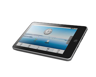
Well it took forever to get to me, but I finally got the new case I ordered for my Haipad Android Tablet from Pandawill.com. Here's the link: http://www.pandawill.com/keyboardstyluscase-for-7-tablet-gpad-g10-g11-nupad-m002-apad-smart-q7-mid1black_p38465.html (they also sell it in white, btw).

[ Haipad case (left), Pandawill case (right) ]

The case that came with my Haipad Tablet is ok. It's very compact, light weight, easily fits in my purse, and does a good job of protecting the screen. What I didn't like about it was it's pretty much the same dimensions as the tablet itself, and with the little manufacturing defect on the tablet that makes the microSD card stick out a bit it's in great danger of being cracked off. Also, it uses elastic bands at the corners, one of which I always have to leave under the tablet or it presses on the button that wakes the tablet. Leaving one strap undone, though, means the tablet isn't really secured in the case very well. For general use, and when I'm putting that case inside a handbag or backpack it's fine I guess. Here are the specs on the one that came with it:

Covers: 5" x 8"
Thickness (closed): .75"
Maximum Tablet Size: 7.75" x 4.75"
Closure: Tab in Loop (friction holds it in place)
Material: Textured leather outside/Suede Inside sewn over heavy card
Tablet Holders: elastic bands

However, I discovered that my tablet touch screen sucks for playing games. You can either move or shoot - not both - and when playing a hardware accelerated game the touch screen isn't as responsive. Result? Most games, especially emulator ones, are completely unplayable on the tablet. It NEEDS hardware buttons to control it. Initially I thought I'd just hack apart some cheap USB keyboard and wire the controller board to an old NES gamepad (or buy one of the USB "Retrolink" ones and see if it worked). But then I saw a "leather" case with a built-in USB mini-keyboard on Pandawill.com for under $25 shipped!

This is a pretty neat case actually, because it effectively turns my Android Tablet into a Netbook - or actually it's more like a UMPC (Ultra-Mobile PC), what they used to call a "Palmtop" computer. And, yes, the games are playable now that I have actual buttons to push. Unlike the photos on the web site, mine has a mini-USB plug on the end, not a full-size USB. Here are the specs:

Covers/Keyboard: 5.5" x 9"
Thickness (closed): 1.5"
Maximum Tablet Size: 4.75" x 9" x .5"
Closure: Vinyl tab (magnetic catch)
Material: Textured artificial leather (aka "vinyl") inside and out
Tablet Holders: vinyl covered Metal Tabs

Another nice feature of it is the kickstand on the back so it can be propped open for use like a netbook:

[ Kickstand on back of case ]

I had to bend the top tab with a pliers a little to get it to catch the edge of my tablet. Mine is a Haipad M701-R, which isn't actually listed as one of the models on Pandawill's site - even though some of the ones listed are often referred to as interchangeable rebrands the actual tablet dimensions can be different. Once I adjusted things a bit, though, my tablet is VERY secure in this thing (I can barely slide it out at all in fact). Knowing it was for a tablet a little larger than mine, though, was part of the plan, as I mentioned the extra space means I can leave my micro-SD card inserted without worrying it will hit anything and it's actually enough space to leave the keyboard plugged in and not have the cable sticking out of the side (would be even better if they had put a 90 degree connector on it though).
It may be a little larger and heavier, but it's still better than lugging around my old HP Pavilion laptop!

Saturday, November 20, 2010

Google Chrome Doesn't Count

The title of this post may be a little (intentionally) misleading. I'm not arguing the validity of Google's Chrome browser - in fact I generally like it and it has become my default browser. Using Chrome to browse the web is pretty sweet. Designing pages the work in it is not, and it's driving me around the bend.

I have a web project I've been working on for a while that uses linked stylesheets. Several of them, and it also has a feature that lets users switch one of the stylesheets out with any one of three others - which is only supposed to restyle part of the layout. In Safari it works as it is supposed to. In Chrome? Not so much.

Chrome has had a bug now for over a year that still isn't fixed, or at least not entirely. When working on the files locally (that is, just opening the HTML file in the browser right off my hard drive) Chrome doesn't "see" all the stylesheets properly. I'm only certain it is loading one of them (the third one) that styles the framework of the page, and I know it's loading because, well, the frame is styled.

However, when I try to use Javascript to reference the first stylesheet it complains that I'm trying to get values of elements that don't exist. Even more oddly, it WILL swap out that stylesheet it thinks doesn't exist with another. If I try to get the length of the array of linked stylesheets with "document.styleSheets.length" it says ZERO. That's right, it is obviously loading one of the stylesheets and swapping another out but the stylesheets array is EMPTY. Now, if I copy and past the content from the external stylesheet into the HTML document, though, then the array reports "1" for the length. So it would seem the array only works for stylesheets in the head of the document - it doesn't count the linked ones.

Ah! But here's where it gets really confusing. If I access the exact same document and linked stylesheets via a web server everything works. The stylesheets array iterates correctly, there are no "null" or "undefined object" errors. In other words, over a web server, it works perfectly. It's only when no web server is involved that it won't work!

Thankfully this isn't going to burn me too badly - the project (an HTML5/CSS3/Javascript "app" of sorts) was always intended to be hosted in the cloud and therefore accessed through a web server. There were initially some plans to wrap it up in a nice package and deliver it as an Android and iPhone app that could be used locally and offline. It also means - even though this is pretty static code - I'm going to have to do my development over a web server. Good thing I already have XAMPP installed!

Oh, and for anyone else who might run into this and be looking for a solution, it seems there isn't one. Or at least not a total one. You CAN actually reference the linked stylesheet with "document.getElementById("name")" if you gave the "link" tag an "id." You can create a linked stylesheet array with "document.getElementsByTagName("link")" and that will actually show the correct number for linked stylesheets. But neither of these methods will allow you to directly query the CSS rules within the stylesheet. If you apply a class from the stylesheet to an object in the HTML page, though, you can use that object as a way to get the attributes of the class. So, as a work-around you could create an object, hide it, and apply multiple classes to it from the stylesheet and then use javascript and the DOM to get the info. Obviously, though, you wouldn't be able to apply visibility or positioning classes, so this work-around is also limited.

Friday, October 29, 2010

Android Device Screenshots

How did I get those clean screenshots of my Android home screen like those you've probably seen all over the place? It's easy!

Download and install the Android SDK from Google (its free and available for Mac, Windows, and Linux).

Look in the "tools" folder and launch the "ddms" application.

A new application will open, click on your device in the left-hand pane (should be the first thing in the list - even though it might have some weird gibberish name of numbers and letters). Now go to "Device" in the menu and select "Screen Capture."

A new window will pop up with an image of whatever is being displayed on the screen of your Android device. There are buttons to rotate it and save it. Give them a unique file name and save them to somewhere as PNG files and that's it!

Making My Hiapad M701-R Pretty

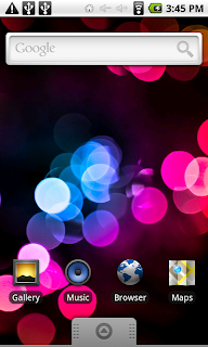
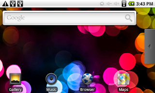
I've seen some really nice looking Android home screen set-ups, but plenty of them are on "rooted" devices or are running some community ROM. The following images are screenshots from my Haipad M701-R tablet - it is unrooted and not hacked, so these mods could be done by anyone on probably any 2.x Android device. I'll start off with the default Homescreen, the only thing I did was change the wallpaper.


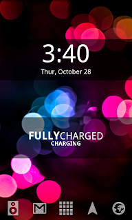
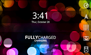
LauncherPro is probably the most popular launcher replacement app on the Android Market. I'm using the "free" edition, there is a paid version with more features. The following screenshots are LaunchPro with BattStatt battery status monitor and Digital Clock Widget by Maize:
If you don't like LauncherPro, or don't feel you have a need for it's many settings or themes, you might want to try out Zeam. Zeam is a lightweight launcher alternative. It doesn't offer multiple docks or the ability to use custom icons or themes, but it's very responsive and doesn't require much overhead. Here are screenshots of it with BattStatt and TypoClock:

Both Zeam and LauncherPro are in the Android Market, as is BattStatt (all free). The Digital Clock Widget by Maize used to be there, but I couldn't find it through that software channel so you may have to look for a web download or another app store for it. TypoClock also didn't seem to be in the official market so I got that via my web browser (hint: Google "TypoClock.apk download"). Both BattStat and Digital Clock Widget can be adjusted between 1x1, 1x2, and 1x4 configurations (if you want you can put them alongside each other so they look like one widget). TypoClock is less configurable - it will only sit in the middle of the screen. I didn't use it with LaunchPro because, for some reason, the bottom of the text gets cut off in landscape mode.

Of course you can use whatever wallpaper you want, and both LauncherPro and Zeam work with Live Wallpapers.

Friday, October 22, 2010

Review: Haipad M701-R Android Tablet


The Haipad M701-R Android Tablet is considered a knock-off of the Apple iPad, and I'll grant you that the silver one (like I got) does bear an obvious resemblance, but you could say the same of pretty much any tablet on (or about to be on) the market.

This tablet is manufactured by Shenzhen Laihanga Trading Co., LTD. in China, also known as Shenzhen Haina Digital Technology Co., LTD, also Haina Technology, and "Haipad" is their brand name/product line. The tablet itself is manufactured for other OEMs (with variable configurations) and is also sold as the G10, Apad E7002, Eken M7001, and probably others I've never heard of. They aren't all technically the same device - some have more or less memory, some have 2 USB ports, some have HDMI output, and the Haipad that I bought comes with an infrared remote. The individual OEM is also responsible for firmware updates, since the actual hardware configurations vary (that's a word of warning about applying the firmware update from one brand to another - you can potentially brick the tablet).

Specifications:
CPU: Telechips TCC8902 720 MHz with G-sensor
Memory: 256 MB RAM
Storage: 2 GB Flash built in, up to 32 GB via MicroSD card
Screen: 7" Resistive Touch Screen (WVGA 800x480 widescreen) supports 2 point multi-touch
Video: 3D Hardware Acceleration, 720p/1080p Full HD output over HDMI, 1.3 MegaPixel camera (front)
Audio: Built-in mono speaker (on back), built-in Mic, 3.5mm stereo headphone jack
OS: Android 2.1
Ports: Mini-USB/OTG, mini HDMI
Network: 802.11 b/g WiFi, technically supports 3G modems (but not in USA)
Battery: Dual-Core Lithium-Ion 1600 mAh
Weight: 350 grams
Included Accessories: Leather case, IR remote control, HDMI cable, AC Power adapter/charger, USB Host cable, USB OTG cable, earbuds
Price: varies, currently hovering around $150 + shipping.

I also got a free 8 GB MicroSD card with it, but that was a store promotion.

The Good:

Screen
The g-sensor works great for changing the screen orientation, the screen is quite responsive and 2-point multi-touch pinching zooms in the browser (haven't noticed it working in any other apps).

I know Apple has done a stellar job of convincing everyone only the more expensive "capacitive" touch screens are worthwhile, but a "resistive" screen has its place too. First of all resistive touch screens have been around forever so they're quite inexpensive components - which keeps the overall cost of the device down. Secondly, you don't HAVE to use a stylus on them. They WILL respond to a finger press (yes, you have to press), but I'm a girl so I have long enough fingernails that I can navigate the screen without pressing hard or using a stylus. Of course it does come with a stylus if you need it, and if you plan to use handwriting recognition, handwritten notes, or sketching apps you'd actually WANT the precision of a stylus over your stubby finger.

Videos look fairly good in low lighting, but the screen has a very narrow viewing angle if you don't want color shifts/washouts.

USB
Mounting it as a USB device to my computer worked flawlessly in both Windows 7 and Mac Snow Leopard, USB hosting works for input devices and flash drives (basically anything that doesn't require drivers to use it, so digital cameras won't work as webcams but will work as external storage devices to get your pics onto the tablet), haven't done any firmware stuff yet because I'm not sure the available update is actually for my specific device.

Extras
The tiny remote control works nicely, HDMI output works for 720p and 1080p videos. The leather case is really basic. There are nicer ones out there, but it does the job. It comes with a stylus if you don't have any fingernails with which to navigate the screen, and there is a holder for it in the case but not on the device.

Networking
Connected to my wifi and the public access point at my college without issues, Android Market works, as does YouTube. It says it supports 3G and comes with a huge list of Asian and European services listed for that in the settings, but (as I expected) nothing for the United States since, by all accounts, no US 3G modems will work with any of these Chinapads.

3D Accelerated graphics
I checked the 3D accelerated graphics. Gears reports an average of 100 fps, and I've tried a 3D home screen that works nicely, I'd only recommend 3D games that are light on system resources (for example, Racing games are too choppy to play).

Android Marketplace Works
A problem a lot of these off-brand/no-name tablets have is access to the official Android Marketplace. As an end-user I don't really know or care about the OEM's issues or arrangements with Google over the Marketplace, so long as I can get apps, which on this device I can.

As an eReader
It (thankfully) didn't come with any eReader software on it, so for eReader duty I have Kindle and Acrobat Reader installed, both of which work fine.

Generally I'm happy with it. It does most of what I expected it to do as a "media consumption" device. It definitely isn't an iPad, but it also cost a fraction of what an iPad costs, and once the Galaxy Tab, HP Slate, and Blackberry tablet are on the market this Haipad tablet will STILL only cost a fraction of others available on the market. However, in the low-end gray market you'll encounter devices that are poorly supported, missing features, and generally seem like a prototype that really wasn't ready to ship but they're selling it anyway.

The BAD:

Higher Screen Resolution
The screen resolution is set rather low - in fact it won't even display the names of files and folder in icon view when using the File Explorer and in list view it's nearly impossible to click on the first entry because the toolbar is so huge it covers it. The desktop looks really claustrophobic too. For a 7" screen the LCD density really needs to be changed to allow more stuff to fit! I gather there is no easy way to do that without rooting the device. I know there is a (pay) app for adjusting that - which still requires root - but it's probably something I'd set once to my liking and leave alone so I'm guessing there's a config file somewhere I could edit and do it for free?

Unmount USB Flash Drive Option
The good news is the USB host works and (with the provided adapter) you can plug a USB flash drive into the tablet. The bad news is there's no simple way to unmount it when you want to unplug it. On some other devices people have put them into "hibernate" to unplug, but there is no Hibernate option (probably because it was problematic, as it is on some devices). So the only options are to either risk data corruption and just unplug it anyway, warnings be damned OR to shut the tablet down and unplug the USB drive.

Menu bar "Back" and "Menu" Buttons
It already has a "Home" button on the menu bar, but it really could use virtual versions of the other buttons as well!

Camera is Reversed
This is a problem with Front Facing Cameras that has turned up on a number of Android phones. It is apparently a software issue, I think. There are some camera apps that offer a "mirror mode" that reverses the camera image on purpose (makes it easier for the user when video chatting I guess so your left hand isn't on the right side of the screen), but in this case that's not what's going on.

I know at least one of the phones that had this problem (HTC Evo) got an update with a "Mirror Mode" setting to fix it - but it really only mirrors the mirrored image, the native camera signal is still reversed. Oh, and I tried downloading a couple different camera apps and it appears the front-facing camera in this tablet is not being detected as one either? I don't really plan to use the camera much, if at all, but it would be nice to fix it if that's possible.

G-Sensor Partially Reversed (Sort of)
Now that I've put a couple of games on the tablet I've discovered my g-sensor is half-way reversed. When looking in landscape mode the top and bottom are correct, but the left and right are reversed (or if in portrait mode, left and right are correct and top and bottom are reversed), but this is ONLY in the games! The OS screens, settings screens, web browsers, Market, etc., (pretty much everything BUT games) detect the orientation correctly, except for a couple of non-game apps that will start in portrait mode and get "up" wrong initially, but once you get into the program they orient correctly. Which means if I used the g-sensor fix I also found at SlateDroid the games could be made to orient correctly, but then EVERYTHING ELSE would be wrong. I'm guessing that a lot of the basic apps (like browsers, settings, etc.) query the OS for the sensor data/calibration, but the games seem to have their own calibration setups (which all seem to automatically try to detect the g-sensor orientation, and inevitably get it wrong. Would be much better if you could just TELL them which end is "UP"). So I'm not sure if there is really a g-sensor calibration issue or not, or if it's just a software issue with the games I tried.

Barcode Scanning?

Lots of Android apps have corresponding QR codes you can scan off a monitor to download and install them, and QR codes are showing up in a lot of other places (with things like the URL of a company site or a person's business card data). I've tried four different barcode reader apps and none of them have worked.

First of all it's tricky because it's a front-facing camera, and it takes mirrored pictures which I'm not certain makes any difference (I've found conflicting information about that, since apparently some scanners can compensate if they detect the registration squares are in the wrong positions - like if you were scanning the QR code upside down, but that would only rotate it not sure about flipping it). Even if they are mirrored, I downloaded a couple QR codes, flipped the images in graphics software and then tried to scan them off my 27" flat panel monitor and they still didn't register with any of the scanning apps. I've also noticed that the camera takes over-exposed washed-out pictures, so maybe there just isn't enough contrast for the app to "see" that there is a code there?

All those things could easily be fixed in a firmware update, but there's one glaring issue that can't:

Recessed MicroSD Card Slot!
Ok, I'd have to open it up and figure out how (or even if) it would be possible to modify things so the Micro SD card seats all the way. It currently sticks out about 5 mm. There may simply be no fix for this and I'll just have to be careful not to break the card.

Would I recommend buying one?

At this stage of the game I'd say probably not. There are some low-end tablets due to hit the market soon that run Android 2.2 "Froyo" and have capacitive touch screens, and are from companies/sellers in the United States. Granted the projected prices on them are about double what I paid for my Haipad M701-R, so if price is your primary concern these low-end, gray market resistive screen tablets running slightly out-of-date versions of Android may still appeal to you. Be aware, though, that you can't just upgrade Android devices like you can a desktop OS! You're pretty much at the mercy of the OEM to release a firmware update, and many of these low-end Chinapads don't have the technical specs to run any later versions of Android.

Thursday, September 30, 2010

Review: Augen Gentouch 78 Android Tablet

I recently acquired an Augen Gentouch 78 Android 7" tablet. These are (were?) sold at Kmart for $150 - $170. That means they are probably the cheapest Android device of any kind sold in the United States. However, if you're just looking for a cheap Android device you may want to consider buying a gray-market Chinese Android-powered iPad knock-off with more features for about the same money OR just get one from one of the US phone carriers (they'll give you a low price on the device, but you'll have to pay a lot more in the long run for phone/data service).

Never heard of Augen? Nobody has. They're a tiny, 13 person company in Florida that made a deal with Kmart and a Chinese OEM manufacturer to import an Android tablet that met Kmart's sub-$200 price-point. There is a more fully featured version of this tablet available called the Dawa D7 which has a microphone, 3D accelerated graphics, at least 2 point multi-touch capability, 3G modem connectivity (but possibly only for Chinese modems), HDMI video output, and 2 USB ports (but I believe only one is connected to the USB 1.1 Host driver, which still means you can connect things like USB flash drives and some keyboards and mice). There's also a more functional no-name version available for about the same price with a camera.

There are probably others. What is disconcerting is that Augen removed so much of that functionality! So what DON'T you get with the Augen Gentouch 78?
  • No g-sensor/accelerometer. Reportedly has one integrated, but due to firmware issues it doesn't work.
  • No 3D Accelerated Graphics. Again, it's physically present but not enabled either due to an error in the boot init file or purposely because Augen didn't secure the proper OpenGL license.
  • No multi-touch. Generally resistive screens don't have this, but some have a "2-point" form.
  • No USB Host driver, rendering USB connection "data only" (and that doesn't work well either).
  • No microphone or camera. The circuit board is there, but nothing is soldered to it.
  • No HDMI output
  • No 3.5 mm headphone jack (it has a 2.5 mm and no adapter)
  • No Android Market (despite it being listed on the box) because Augen didn't license Google proprietary apps.
Most, if not all, of those things ARE available on the other versions of this tablet.

When I first turned mine on the older OS installed made the device virtually unusable! One of the first things I did was apply Augen's OS update which at least made it functional enough to use for web browsing and emailing. You won't get Flash to work on it, most Android games don't work (either because they require 3D graphics or 3-axis accelerometer). It came with Skype Beta installed, but without a microphone or a camera it's useless.

To install the OS update I had to dig out my old Windows XP laptop because it's the only reliable way to apply the update. Even with Augen's USB driver updates for Windows I have never been able to get it to transfer files from Windows 7, or from Mac OS X. I can explore the files and folders in the "nand" folder on the device, and copy them to the computer but they won't transfer in the other direction. This is a real problem considering Market is broken on it because it means I can't even "side-load" apps. If I can't find a straight download link in a web browser ON the Gentouch, I can't install anything. In fact, installation from browser downloads on the device was the ONLY way I added any software to it. Problem is most Android apps are IN the Android Market - even most software search sites just aggregate their listings from what is in the Market and send you there.

Ok, there IS a way to get the Android Market to work on it that involves "rooting" the device (gaining root access) via the Android SDK developer toolkit and a console. I had no success rooting this device and gave up trying before I bricked it. I was, however, able to temporarily gain access and download some apps (some of which couldn't install because of the limitations of the device), by doing a factory reset on the Gentouch - which wipes out all your user data - and set up a new Google account. That worked until I rebooted the Gentouch, after which Market was broken again. There is apparently some root-level cache that needs clearing to fix this. But the REAL issue is that Augen never got a license from Google to access the Android Market - despite the words "Download hundreds of apps from Android Market" on the box.

A bigger problem is if you happened to be somewhere on a wifi hotspot with someone else who had one. Augen shipped these things all with the same MAC address on the wifi radio! It's not even Augen's MAC address - it belongs to Atheros, the manufacturer of the wifi chip. What it means is every one of these made is identical to a network - thus the problems if you have more than one of them trying to connect to the same network. It also means that, if you only allow certain devices to connect to your home network with MAC filtering, the network can't tell the difference between YOUR Gentouch and anyone else's - AND that MAC address is all over the web - so it represents a risk to a secured wifi network. How could Augen have sold these with every one having the same MAC address? Well. . .

The FCC says they have no record of the Augen Gentouch 78. Anything that emits, sends, or receives radio waves (pretty much all electronics) have to be submitted to the FCC for inspection, documentation, and are then issued an FCC licence if they are found to be within Federal tolerances. Apparently Augen never did this, or the FCC surely would have caught the MAC address problem.

I'm planning to return it to Kmart as "defective" and get a refund. This is an incomplete product that probably isn't even being legally sold in the United States in the first place. Some of the problems aren't fix-able because the hardware for those features was omitted and the software/firmware errors are only repairable if Augen releases updates and acquires legitimate licenses. Kmart really should just recall the damned things as all being defective and send them back to Augen. Let them deal with it.

UPDATE: Returned it to Kmart for a full refund. I have ordered (elsewhere) a Haipad M701R tablet to replace it. I'll write a review of that whenever it arrives.

Friday, September 17, 2010

Fix: Linux screen blanks during video playback

Whenever I play videos on my Linux box with a browser-based player (i.e., YouTube) or Hulu Desktop after a few minutes the screen goes blank. I bump the mouse and it comes back. The screensaver is not only not turned on, I uninstalled it completely. Power Management is set to "never" turn off the monitor. So I find out that many Linux distros apparently ship with TWO screen savers and power managers activated. There are the "Gnome" (or KDE) ones and then there are the X server ones. It's easy to turn off the ones in the Desktop Environment, but that doesn't turn off the X server ones!

Ok, so forget most of what you've read on the internet regarding this - lots of the "fixes" out there refer to display blanking while in text/console mode or for older versions of the X server, or additions to your xorg.conf file which don't work anymore. Plus, the fixes generally don't survive a reboot or a restart of the X server, others won't take effect until you do restart the X server. Argh!

But, remember, I said to forget about those? Yeah. So here's what finally seems to have solved it for me. You use your administrative privileges (you have those right?) and open the following file in your favorite text editor:

/etc/gdm/PreSession

At the end of it tack on the following two lines:

xset s off
xset -dpms

Save the file, reboot. That *should* (if you have every other screen blanking/saving feature turned off) prevent it from blanking out the screen after several minutes while watching online videos.

Some Linux players, such as XBMC, don't require this fix as they implement other methods to prevent the screen blanking when you haven't touched the mouse or typed anything in a while.

Review: Samsung Syncmaster P2770HD Monitor/HDTV

If you read my previous post about the 27" LG monitor I bought (which died after just 14 total hours of use) I exchanged it for a Samsung Syncmaster P2770HD monitor/HDTV in part because the store didn't have any more of the LG monitors, and in part because - after such a bad experience with them - I didn't want another one.

Samsung has a pretty good reputation in the flat panel biz, both with their computer monitors and HDTVs, and this was the monitor I had originally been considering until that damned LG seduced me with it's S-Video port and $80 lower price.

Pros:
Crisp text in computer mode, great color, decent built-in speakers with 5.1 surround and SRS. Remote control makes it easy to switch modes and control TV from a slightly more viewable distance. Feels very solidly built (meaning it's also HEAVY). If all that screen acreage is a bit much for you it includes something called "Multiscreen" which lets you portion off the screen into smaller virtual screens.

Cons:
No tilt adjustment on the acrylic base. It's head on only, so you're desk/chair better adjust to the monitor, not the other way 'round. Remote has some buttons on it that are poorly explained in the manual (in fact I've yet to figure out what two of them even do). Built-in speakers could stand a bit more volume range - I really have to crank it up just to hear it well from a decent viewing distance. A signal strength indicator for digital TV channels would be nice too. Also, it seems there's a bit of motion blur in TV mode that I don't see in computer mode (while playing a game).

All in all, though, I'm quite happy with this monitor and would recommend it to anyone looking for a big - but not TOO big - screen.

Wednesday, September 15, 2010

Review: LG M2762D-PM HDTV/Monitor

I finally decided to drop on a new flat panel computer monitor, and I haven't yet upgraded from the 32" CRT TV to an HDTV. So when I saw a 27" LG M2762D-PM combo computer monitor and HDTV for $360 at Microcenter I jumped on it. I initially thought I was lucky to have nabbed the last one in the store (possibly the last one any one of their stores had - as it can't be found on their website anymore as of this writing). Turns out I was wrong about being lucky. Read on. . .

Pros
Very good price for a monitor/HDTV at this size. That was primarily what attracted me to it was the price, but it's also a good looking set. There's only so much designers can really do with the flat panel format, so it's all down to the bezel. The LG has a cool glossy acrylic frame that goes from black to clear at the bottom edge. All buttons are touch sensitive (i.e., there are no actual buttons). It had an acceptable HDTV picture, and the tuner (like a lot of HD sets) has an indicator for signal strength, program info, etc. Auto programming was simple, in fact the whole On Screen Display was very nicely laid out and polished in appearance. The remote was good, the main feature of which was one button access to switching the source from TV to computer. Unlike some monitors in its class this one did have a tilt adjustment. It does have an S-Video input on the back, in addition to all the other requisite HDTV and computer monitor ports.

Cons
Base seemed a bit flimsy, though the monitor itself isn't all that heavy so it may be adequate. "Vivid" color is TOO vivid - like clown colors that punch your eyes out. Thankfully you can dial it down to something watchable. Text in computer mode wasn't very crisp, even with font smoothing turned on. The built-in speakers are garbage - very tinny and not enough volume. Doesn't ship with either an HDMI nor DVI cable, just a VGA cable. Like anyone is using VGA anymore?! Plus, the whole point is to get a crisp DIGITAL picture, right?

But there is one gigantic 800-pound gorilla of a negative regarding my experience with this monitor: IT DIED AFTER JUST 14 HOURS OF USE!!!

I bought it on a Saturday afternoon. Surfed the net a bit, then watched some TV shows and turned it off to go to bed. Sunday morning I turned it on, checked my e-mail, watched a TV show, then turned it off to do something else. Two hours later I returned, hit the "Power" button on the remote and. . .nothing. Touched the power button on the front of the monitor. . .nothing. The thing was stone dead just like that.

Boxed it up again, took it back to the store and exchanged it for a Samsung Syncmaster P2770HD monitor/HDTV, which is what I should have bought in the first place.

Tuesday, August 17, 2010

Linux Nvidia Overscan Fix

The ATI graphics card in this media center recently died and I decided to avoid all the ATI-related issues and just put a Nvidia card in instead.

This allowed me to upgrade the operating system to the (current) Ubuntu 10.04 Lucid Lynx - well, I decided I like the Linux Mint 9 version a bit better. Nvidia's Linux drivers are much, much better than ATI's.

The last problem remaining was the "overscan" - well, for me it was actually UNDERSCAN, which puts black border all the way around the picture. The newest Nvidia drivers do have a slider and text entry box for overscan correction. This works for some people, but I was in the camp for whom the control panel crashes if I touch the slider.

The default values the Nvidia driver inserts vary and I don't know what determines what they are but I suspect it's tied to resolution as it was "13" at 1024x768 and "8" at 800x600. Most sites that talk about how to fix this talk about "Modelines" and other Xorg.conf fixes, but thanks to THIS POST there is a MUCH easier fix to implement! Enter the following line in a terminal:

$ sudo nvidia-settings -c :0.0 -a 'TVOverScan[TV-0]=15'

Your value may be different, but for my set-up "15" is the magic number that fills the screen. I found that even using "sudo" permissions and saving settings to xorg.conf with the Nvidia Control Panel that this setting didn't stick after a reboot. It's annoying to have to re-enter it on every boot and I also realized it doesn't HAVE to be entered with "sudo" which makes it a cinch to execute at startup. Just take that line and (without the sudo) paste it into a text file and save with a simple name like "nvidia-fix" into your home folder. Right+Click, go to Permissions, and check the "executable" box. Then, I used the "Start Up Programs" control panel and created a new entry with the command to execute that text file as a program (the same as if I'd typed it in a terminal):

./nvidia-fix

and name the entry something that will make it execute AFTER the Nvidia Panel is loaded (I named mine "Overscan").

Now, every time I reboot the media center it loads the Nvidia stuff (with the black border all the way around) and within a second the fix script executes and expands the picture to fill the screen, then XBMC launches full screen. Simple! Fully automatic fix at every boot, no mucking with the Nvidia control panel, no editing your xorg.conf file.

Note: When you run the overscan fix without sudo permissions and you launch the Nvidia Control Panel the fix will be over-ridden by whatever setting is in the panel (the screen will shrink and the black border will re-appear). Make whatever changes you were going to make, save them to your xorg.conf file (if you want them to persist beyond the current session), and then either re-run the overscan fix script or reboot the system so is auto-runs again.

Sunday, August 15, 2010

Review: Matias USB 2.0 Keyboard vs. Apple Aluminum Keyboard


I know some people rave about the Apple aluminum keyboard, so I'm probably in the minority of people who don't like it. Actually I really kind of hate it.

Sure, it's thin and sleek - it wouldn't look out of place in a modern art museum collection. However, I can't stand typing on the damned thing. I tend to type in bursts, usually around 80 wpm at about 90% accuracy - some people have said listening to me type sounds like a machine gun! LOL I'm definitely not one of those people who "caresses" a keyboard and I generally don't even look at the keyboard unless I need a key I don't tend to hit very often. Which is why the Apple keyboard bugs me. First of all the keys are too FLAT. I like the dished keytop as it helps me to better feel my positioning on the keys. Sure those little bumps on the home keys help make sure you're not typing gibberish, but totally flat keys just feel awful to me. According to what I've read, the Apple aluminum keyboard is supposed to be similar to a laptop keyboard, and I hate typing on a laptop keyboard too. They frankly feel like calculator keys - or (and this just popped into my head) it reminds me of the Timex-Sinclair 1500 "chicklet" keyboard. Oh, and the USB port on it is tucked under the edge which is a pain in the butt when you want to plug a thumb drive in there (especially desirable if you're using the iMac) you pretty much have to fumble around until you plug it in sight unseen OR you end up lifting the keyboard to see where the port is and plug in your device.

There also isn't enough travel to the keys when you type like I do. On the Apple keyboard I continually found myself entering keystrokes when I hadn't intended to do so, and because I press the keys pretty hard the shorter travel results in greater finger fatigue for me. All in all, the Apple keyboard cuts my speed and accuracy in half. Obviously that's not the case for everyone, as you don't have to look far online to find people who LOVE that keyboard and argue it's possibly one of the best Apple ever made. That's fine if it works for you, but it doesn't mean I have to live with it.

Secondary problem is that I switch back and forth between Mac and Windows a lot on the same machine. I know other people who do that with Parallels rather than rebooting into another drive or partition, but the problem is the same - Mac and Windows keyboards are NOT alike! You always have to make a trade-off when platform hopping between the two with keys being in different order or some functionality missing whether you try to use a Windows keyboard on a Mac or an Apple keyboard on a Windows machine. It's annoying!

Clarification: Someone said to me today "All USB keyboards are cross-platform compatible." Well, yes, technically they are. The keys will just re-map, and a Windows keyboard will use function keys for media keys, etc. But this is about having a keyboard that actually HAS all the keys for both platforms as well as has the keys MARKED for both platforms where they are different. This same person also told me "Logitech makes keyboards for both Mac and Windows." I went to the Logitech web site and, sure, they have check-boxes to narrow your search to "Mac compatible" and "Windows Compatible" keyboards. All of which are gaming keyboards and all of which are ONLY have their keys marked for use on Windows.


Which is why I'm really diggin' this new Matias USB 2.0 keyboard. Nice, springy, responsive keys with the right amount of travel, just enough dishing so you don't end up with high or sharp edges, a 2 port USB 1.0 hub for my mouse and tablet and a single USB 2.0 port on top for easily plugging in my thumb drive. But the coup de grace to my Apple keyboard experience is that this is a CROSS-PLATFORM keyboard! It's kind of weird to see a keyboard with BOTH a (Windows Logo) and (Mac Command) symbol on it, but if anyone else sits down at my computer - regardless of which OS I've booted - there would be no guessing which keys to press.

Well, maybe unless you want to eject the DVD drive - that requires holding down F12 in OS X, but for some reason Matias didn't bother putting the "eject" icon on it. I do, however, have volume control keys nicely made half the height of the surrounding keys so they're harder to hit by accident and easier to find by feel. They also had a really good idea regarding the Caps Lock key - instead of being over by the Tab key (where people - including me - hit it by accident all the frickin' time) they moved it to the lower right next to the Alt/Command key. They also put the Num Lock key there and replaced it with a Tab key on the keypad - which is sweet for entering data ten-key style in forms or spreadsheets. Set-up on Mac does require you to reassign the Command and Option keys so they match the keyboard layout. Windows automatically recognizes it as a Windows keyboard and USB hub.

The only design changes I think I'd make to it (or recommend Matias consider) are to add that eject icon to the F12 key (or maybe ADD an eject key - there's plenty of room above the keypad), and possibly move that USB 2.0 port into the bezel space on the left side of the keyboard by the additional CTRL key. Why? Because my keyboard sits in a pull out tray and unless I pull it out so far it's falling into my lap the USB 2.0 port is still under the desk top where I can't plug my thumb drive into it. Other than that, this is one of the nicest keyboards I've used in a long time and it can be had for a pretty reasonable price of around $30. I got mine at Micro Center, but tons of places online carry them, and you can buy direct too. If you dual boot, are using Parallels a lot, or if you also don't like the Apple aluminum keyboard, you may want to give this one a try.

Saturday, July 10, 2010

Linkworld "Imposter" Case


I'm building up yet another computer so I recently bought this case from NewEgg.com (Linkworld model 431-0 C.2222) for a little less than $40. It is also available in silver, by the way.

The Cons
Well, some would argue the case design itself if the con, as in "con job" since it's obviously made to remind us of a certain fruit-themed professional computer. But setting that aside for the moment and just talking about the case itself, this thing is a VERY cheaply made case. It is made of rather thin sheets of metal, though the rolls and indentations do lend it a little bit of strength I wouldn't set anything heavy on it. The "handles" are just loops of plastic, and many of the reviews I'd read online about this case noted that the case arrived either with plastic already broken (the shipping box has almost not padding, I'm surprised mine survived UPS shipping) or that as soon as you had some weight in the case and picked it up by the handles they cracked off.

I'd also read comments that this case was, at one time, sold as JUST a case for around $10. That's honestly about what it's worth, but mine was the aforementioned higher price and came with a case fan and a Power Supply Unit installed. I wish I'd found this case for the cheaper price, because I'm going to just throw the PSU away because it's an obvious POS. It is the single lightest weight PSU I've ever held, which makes me seriously doubt it can handle the 500W rating printed on the side. It's frankly the sort of PSU that is a fried motherboard waiting to happen. The case fan is very standard, with no markings to help me know who made it. If you were going for a pimped out case with LEDs you'd be tossing this fan anyway. I'll probably leave it in the case until it inevitably starts screaming or just stops turning.

It's a fairly tight case, so expect things to be crammed together and also expect you'll cut a knuckle or two on the sharp metal edges trying to fit components inside. It's not the most compact case I've been inside of, but it's not spacious by any stretch of the imagination.

No front panel Firewire, even though there is a spot for one and the front-panel circuit board is drilled out for a port and header. They obviously decided the few pennies it would cost to add them was just too big an investment in this case, which is truly built to a very thin penny.

The Pros
The front (plastic) panel has a ton of holes in it, so I'd think this case will have very good ventilation. Heat is a real computer killer, and it seems like no matter how many fans I stick in my current system it's never enough. I plan to have a virtual hurricane blowing through this case. It also has two nice doors for optical drives that flip down when the CD/DVD tray pushes them open, which always looks nicer and cleaner than the actual faceplate of the drive - and also means you can install drives with mismatched colors or brands since they'll be hidden from view instead of sticking out the front of the computer all the time.

The plastic "handles" on the bottom hold the case up off the floor. I've noticed with most towers, sitting on carpet under desks the front case fan - almost always located at the bottom front - tends to quickly get clogged up with dust bunnies and pet hair - or whatever else is blowing around on your carpet. I'm hopeful that having the case up on stilts will reduce that problem. A case with handles is also considered a "pro" for those who like to drag them to LAN parties or use them to DJ (see below for "Improvement" to make the handles something you can actually hang on to).

I suppose "it's cheap" is also in its favor. If you want your computer to look like the bastard child of that certain other computer the design may be in a "pro" in your book as well. It does have a nice floppy drive face integrated into the front panel, which nicely hides the ugly standard floppy faceplate - though it would be nice if they also gave a blank out plate since the era of floppy drives is pretty much over. The 3.5" bay below the floppy drive looks like it has a blank out plate in it, but it's actually a flip-down door. So if you install a media reader or fan controls or whatever in that bay you can hide them behind a little door which give a cleaner look.

It does have a "vent tunnel" for the CPU cooler to the side panel. That's nice for pulling in (presumably) colder air from outside the case which is why I put it under "pros." Though, since the CPU can be located literally anywhere on the motherboard, those vent tunnels rarely seem to line up where they'll do any good, so it may also be a "con" depending on what mobo you stick in the case.

It's pretty much standard these days, but I have seen cases that omit them, so I'll also mention the two USB ports up front and jacks for headphones and a microphone.

Improvements
With a little work this case can be beefed up a bit. I'm not talking about full on "case modding" here, just simple stuff you can do in an afternoon with a screwdriver and a power drill.

1. Handles you CAN hold on to!
I'm sure the main reasons people have had the plastic handles crack off are because of how they are attached to the case, not the quality of the plastic itself.

The rear "handles" are each attached with two small screws on each side of the case (A) and the front handles are actually part of a single plastic "shroud" around the entire front panel and attach with four very, very tiny screws on the top and four on the bottom (B). First thing I noticed upon lifting up this case - empty - was the handles could MOVE! Movement can lead to cracking, cracking can lead to suffering, and suffering. . .wait, I wasn't gong to do the Yoda quote.

I replaced the eight screws on the back (A) with stove bolts secured with nuts from the back side. You need very short bolts (I had to cut mine down) because on the bottom they'll intrude upon the motherboard mounting plate and on the top the PSU. I also needed to drill out the holes a little larger to do this, but now there is absolutely NO slop in the top back handle, where it had an obvious gap before between it and the case top.

I then replaced the eight screws on the front handles (B) with much larger (but still black and countersunk) sheet metal screws. If you don't mind them poking up inside the case the length isn't that critical (I used 1/2" long ones) since there's nothing in their way. The original screws are so small they have almost zero bite into the case metal, and one of the top screws on mine was stripped out. You could also drill and bolt these if you like, but if you're going to do that I'd recommend only doing it on the bottom where nobody can see it.

2. Front Case Fan
Since you'll have the front plastic off anyway, that's a good time to install a front case fan (D) since you won't be able to even access the two lower screws unless you take ALL the plastic off the front of the case!

3. No Tools Required
Make it a "no tools required" case! I know some reviewers hated the "Card Clamp" this case has on the back, and I've never seen anything like it before myself. Usually PCI cards are secured to the case with a single screw through their backing plate, or on some cases a plastic lever locks each one down. This case has a single clamp that runs across all the installed cards to lock them down. Well, the case that inspired this one's design has a "no tools" system for locking down PCI cards, so I thought "why not this one too?" It's really easy - just replace the two hex head phillips screws (C) on the clamp with computer case thumb screws! Then also replace the side panel screws with thumb screws. Now you won't need any tools to enter the case or to add/remove a PCI card. Now the clamp isn't some weird lock-down method, it's a convenience feature!

4. Add Firewire
As I mentioned, the front panel ports don't include a Firewire connection, even though there is space for one. If you're good with board-level soldering you could easily add one, as the circuit board is already drilled for the port and header, and the case front has a corresponding knock-out for it, so you wouldn't have to hack the case to add it. I thought about going to the trouble, but I only have one Firewire device left and it also has a USB 2.0 connector so I really don't NEED a front Firewire port - or ANY Firewire ports for that matter. I plant to cover up the knock-out on the front panel with one of the system stickers (those little ones that say what CPU is inside or Graphics Card). That will make for easy hardware reference, but also nicely hide the stickers under the door for the front panel jacks.

Wednesday, July 7, 2010

Sourcing Apple

I've been curious lately as to who REALLY manufactures products for Apple. It's well known that Apple doesn't have it's own factories, but contracts other manufacturers to make its stuff. They're not alone in the electronics business - most brand name computer products are actually manufactured by someone else, or at least the components are.

I'm not really interested in the endless "Apple Tax" arguments about Macs being overpriced compared to Windows systems of similar specifications. What I was interested in was the fact that Apple products consistently rank very highly - alongside Asus, who also manufacture parts for Apple, and Toshiba - in terms of reliability and build quality. If I'm going to build a custom system I want to use solid, well built components. So it is worthwhile to research who met the quality standards of a brand ranked high in reliability, right?

Ok, so I don't know exactly which components some of these companies make for Apple, but an afternoon of online research yielded the following list.

Lian Li
CASES
Mac Pro
Other Macs?

Foxconn Electronics / Hon Hai Precision Industry Co., Ltd.
LOGIC BOARDS
Mac Mini
Mac Pro
iPod
iPod Nano

Invantec Appliances
Video iPods

Asustek Computer
iPod Shuffle
12.1" /13.5" / 14.1: MacBook

Quanta Computer (who also manufacture the OLPC I believe)
iMac
MacBook Pro
some iPods

WinTek
TOUCH SCREENS
iPhone
iPod Touch
iPad

LG
Apple LCD displays

HARD DRIVES
Desktops: Seagate or Western Digital
Laptops/Mini: Fujitsu or Seagate

Apple RAM
Usually Micron, may also be Samsung or Hynix.

GRAPHICS CARDS
No idea who actually manufactures Apple branded cards, but the chips are either made by Nvidia or ATi and at least one integrated video chip - the Nvidia 320M - was manufactured exclusively for Apple.

And, if you want the same kind of rock-solid UNIX-based operating system too? How 'bout another UNIX-based OS for FREE! Mac OS X was based on parts of FreeBSD and NetBSD combined into Darwin, which forms the UNIX underpinnings of OS X. You could either install a FreeBSD or NetBSD or you can actually get Darwin for free as well. This doesn't give you Mac OS, though, as a lot of what comprises Mac OS is in a higher-level, proprietary layer used and required by "Mac Native" applications to work, so you can't run Mac native software on Darwin. What you CAN do, though, is run thousands of UNIX and Linux programs, and you can install a GUI desktop environment like Gnome or KDE and "theme" it to look just like Mac OS X, and install AWN Dock which works just like the one in OS X.

If BSD or Darwin are too intimidating, get a Linux distribution since they often have "Live" discs that let you try before you install, and have nice installation wizards when you've found one you like. Whichever UNIX or Linux you choose, you can also use a compatibility layer called "WINE" to run many (but not all) Windows programs - without having to have Windows installed. For many users a BSD or Linux install will meet their needs as well as Windows or Mac OS - especially if most of what you do is surf the web, e-mail, chat, watch videos, use an office software suite there is no reason to be spending money on an operating system or software to do those things. It's only when you need to use professional applications (such as Adobe Creative Suite or Final Cut Pro) that you NEED to have a commercial operating system capable of running them.


Friday, June 4, 2010

Spoofing Google Chrome

Yes, there are STILL web sites out there that do "browser detection" rather than "feature detection." A good example of this is actually Apple's own HTML5 Showcase, which directs anyone visiting it who isn't already using Apple's "Safari" browser to download it in order to see the content.

Let me go off on an Apple tangent for a moment:

This is blatantly NOT how you are supposed to do detection for support of HTML5 features! They're clearly doing it on purpose to give the (false) impression that ONLY their web browser supports this stuff. If you visit the showcase with Google's Chrome browser you'll still get the "download Safari" message, even though both Safari and Chrome are built atop the same Webkit core. Small point, but Apple also uses a lot of Webkit-specific CSS in their showcase too, when there are perfectly good standards-compliant equivalents available, which means other browsers that DO support HTML5 (like Opera and nightly builds of Firefox) won't render the content correctly because they aren't built on Webkit. C'mon Apple! Don't put up a site that is supposed to showcase HTML5 standards compliance and then use non-compliant CSS!!

Ok, back to Google Chrome:

Because Chrome is the new kid on the block and doesn't support add-ons (yet) you can't easily "spoof" the User Agent for the browser. The "User Agent" is a string that the browser reports to web sites that request it telling the site what kind of browser it is. When you send a user agent string that is different from the actual one, it is called "spoofing." The Opera browser has long had a built-in option to spoof (or they call it "mask") as other browsers, because so few sites are built with Opera in mind if there is any code on the site that requires a specific browser (like Firefox or Internet Explorer) you have to set Opera to lie to the site to get the code to work properly. This was even more of a problem back in the early D0t.Com era when so many sites were designed for either IE or Netscape to the exclusion of each other and everyone else! There are add-ons for Firefox that allow it to masquerade as other browsers - should you stumble across one of these anachronistic web sites. But what about Google Chrome?

Well, there isn't an add-on or a built-in method, but it's still relatively easy to do (Windows instructions):

1. Find the Shortcut to Google Chrome that is most likely on your desktop.
2. Copy the Shortcut and Paste the copy somewhere (like back on the desktop).
3. Right+Click and select "Properties"
4. In the first box named "Target" you'll need to add the following to the line that's already there:

--user-agent="Mozilla/5.0 (Macintosh; U; Intel Mac OS X 10_7; en-us) AppleWebKit/533.4 (KHTML, like Gecko) Version/4.1 Safari/533.4"

5. Rename the Shortcut "Chrome as Safari"
6. Use this shortcut to launch Chrome and it will automatically be masquerading as Safari 4.1

Don't believe me? Follow the steps and then go to the Apple HTML5 Showcase mentioned above. You won't get the "Download Safari" message!

You can replace the User Agent string with the string from any other browser, so you could also make shortcuts that launch Google Chrome as Firefox or as Internet Explorer.

Monday, May 24, 2010

When Good Shows Go Bad

This is a general criticism of "epic" television series.

Shows that rise above the usual crap that gets put on TV, don't dumb things down to the audience, and gain a strong - if not rabidly loyal - fan base. Shows that are "epics" in the sense of having multiple story lines hanging off a longer story arc meant to resolve YEARS down the road instead of before the credits roll at the end of each hour.

I'm talking about shows like "Babylon 5," "Battlestar Galactic" (the new one), "Lost," "The X-Files."

All these shows had characters the fans truly CARED about, they had engaging plots - mysteries actually - with clues being revealed little by little over years. Shows that kept the fans guessing, and watching.

All these shows also went awry and largely disappointed the fans in the end.

Of the shows I mentioned, arguably "Babylon 5" had the most palatable ending, but the show was marred by truly awful made-for-tv movies, an extraneous season on the air after the real story ended with an ill-conceived and unnecessary ending, all of which led into an equally pointless spin-off series.

"X-Files" also suffered the sorry fate of additional seasons beyond the point the show should have been allowed to end with dignity, and a couple of equally pointless theatrical endeavors. Worse yet, the main story arc over all those years - regarding the conspiracy that drove Agent Mulder - was never really resolved.

"Battlestar Galactica" outright STOLE it's ending from the last episode of the 1980's BBC "Hitchhiker's Guide to the Galaxy" television series. BSG was a show that literally kept me on the edge of my seat before each commercial break and then totally dropped the ball when it came to wrapping up the story.

Now I've just seen the end of "Lost" after six years of building mystery and largely empty promises by the show's creators that they would explain everything. Like BSG, I have lengthy posts on this blog detailing my disappointments.

No. When a show that has intelligently engaged me and week after week, year after year, built toward something totally blows it at the finale it's not so much disappointing as it is INSULTING.

Where and why do these shows go so f*ing wrong?! Well, I've identified some reasons, and if anyone out there reading this is working on the next epic serial drama maybe you can avoid pissing off your future loyal fans if you keep this stuff in mind.

1. No Clear Plan - so many of these shows seem (and probably are) made up as the go along. A great mystery is introduced without anyone involved with the show having a clue what the answer to the question is. You can possibly get away with sub-plots (the "B" and "C" stories) being cobbled together, but the main story arc needs to be plotted out. That's why they call it a PLOT. Once it's in place, for God's sake, STICK to it!

2. Painting Into A Corner - this can go hand-in-hand with #1 if the show presents a mystery and then makes up crap that produces inconsistencies that mean they can NEVER write themselves out of it without ignoring their own continuity. All the more reason to have a plan in place. This can also happen to shows that are at risk of being canceled before they get to reveal anything important, or take too damned long to drop the clues and lose their audience because nothing has meaning or the story doesn't seem to be going anywhere. Which it isn't if you haven't done #1.

3. Don't Rush It! - Ok, so maybe you've got #1 in place, you've kept #2 in mind, but the show is going to be canceled at the end of season 3 and you had a 5 year story arc. Do you just rush to the ending or let the show die "open ended?" "Babylon 5" faced that problem, and they rushed it by showing us the end of the five year story arc at the close of season 4. Fine, right? Well, number one it FELT terribly rushed compared to how the story had been building, but then they got ANOTHER SEASON. Oh crap! What do they do now? They've got their fifth year, but already burned the arc. And we got a hurried NEW plot, a lackluster season, and a second ending to the series nowhere near as satisfying as the one we already had - and obviously contrived to allow for the story to continue. Which is did, in the even less impressive "Excalibur" spin-off series, itself a one-season blunder.

4. LET IT DIE! - This one is aimed more at the fans than the creators of a show. Ok, I'm a fan of shows too, and often wonder what I'm going to do for that hour each week once the show is off the air. But that is no reason to keep beating a dead horse. You know what happens to dead horses? They STINK. "Babylon 5" got rushed to it's ending, but at least it gave the fans that ending. But the fans felt understandably ripped off by not getting that last, damned season and began one of the many "save the show" campaigns. Same thing happened when FOX was set to cancel "X-Files" and later "Buffy the Vampire Slayer." A little more problematic since we didn't get a solid ending and the fans either wanted an explanation, or some just wanted MORE show. That can be a problem with fans who are about quantity rather than quality. But a show with hundreds of awful, pointless episodes with a replacement cast are NOT a substitute for, say, 13 solid, tightly written, acted, and produced episodes.

A lackluster "zombie" season after a show has had it's run is not going to be as good as waiting for a single TV or theatrical movie that wraps things up. So, please, fan boys and fan girls - LET YOUR FAVORITE SHOWS DIE WITH DIGNITY.

5. Have A Back-Up Plan - since TV networks are fickle and often cancel great shows for no logical reason there are no guarantees a show will get the time it needs for the story arc. Well, one way would be for show creators to insist on three or five year deals (in the same way the three picture deal in the movie industry is pretty standard), shop a show around to other networks after it gets canceled (but stick to the original story arc, not shop it around for more seasons AFTER the story arc has resolved), get a green-light for a movie deal as a way to wrap it up if the show gets canceled, or - if all else fails - finish the story in some other medium like a book, comic, or webisode.

6. Have an ENDING - a great series should be like a novel with a beginning, a middle, and an end. The individual episodes should be "chapters" within that novel. So many shows are reluctant to kill off main characters too - always hoping for that lucrative "spin-off" property I suppose. But in a good show NOBODY IS SAFE. That keeps it interesting for the audience, knowing anyone could die. Everyone could die. If you've made the show all about one or two characters, and without them there is no show, where is the drama if everyone knows you can't kill them off? That leads me to my final point:

7. Plot Driven, Not Character Driven - I am so sick of hearing television writers describe their shows as "character driven" or "character studies." A show's plot should be like LIFE, it will go on no matter who gets sacrificed along the way. The PLOT has to be the main character, and all the characters supporting players. Too damned many shows these days toss out the plot at the end because the writers and producers mistakenly think the characters and their relationships, hopes, dreams, pasts, and futures are more important than the plot. Bullshit! The plot has to be the one, and only, character you can't kill off. I believe every Hollywood hack working on a series should be forced to write a death for each character in the show and ask whether the death of that character also kills the plot. If the answer is yes, then you don't really have a story, you have a biography. A biography of THAT character. Go back to the drawing board and figure out how the story progresses without any of the existing characters. A good story is things happening TO people and having them realistically react to it. A bad story is one where things only happen because of the characters' actions. If the natural, believable end to the story is "everyone dies" then KILL EVERYONE.

There ARE shows that have gotten it right. "Star Trek: The Next Generation" managed a fairly decent finale by tying it back into the pilot episode, even if they did rip off the rest of the storyline. "Star Trek: Voyager" did okay as well, by dealing a major blow to the Borg and bringing the Voyager crew home to the Alpha Quadrant. "Farscape" was totally robbed of a final season to wrap things up, but eventually did get a deal for the "Peacekeeper Wars" which was like a condensed season on speed and delivered a very satisfying finale. "Firefly" was also a stupendously good show that got robbed by not even getting a full season, but the 13 hours we did get were pure (shiny) gold. It also got an equally good, if not frenetically paced, finale in the theatrical movie "Serenity." "Angel" (the Buffy spin-off) had trouble finding it's legs, but the series finale was as satisfying as the end of "Butch Cassidy & The Sundance Kid." The US version of "Life On Mars" (which I've written about previously) had what I thought was a very nice ending that explained everything - unlike the British original version that had a very ambiguous finish.

So, please, TV writers stop making it up as you go, stop phoning it in at the end. Fans, please stop trying to "save" series that have already ended.

In the end, "Lost" lost me as a fan

Last night I, along with millions of other fans, watched the series finale of "Lost." To say I'm a little disappointed would be an understatement. I was hoping for something a little more coherent. A little more of an epiphany, or a Shyamalan-esque twist ending. The "Lost" writers delivered on NONE of these things. None.

If you haven't seen the finale, stop reading. Spoilers follow!

It seemed to me that the writers were intent on not pissing off any segment of the fan-base, so they tried to incorporate aspects of EVERY possible ending into one ending that would give every fan something to take away from it - but in the end just created a confusing jumble that is probably going to piss off everyone who stuck with the show for six years. Six years that often seemed even longer because of enormous gaps in airing and so many re-runs viewers thought they were time-jumping like Desmond.

The ending, much like the entire show, is open to interpretation. It took an hour after the finale finished for me to muddle through and make some kind of "sense" of it all, but there's no way for me to know if I'm correct.

Things fans were hoping for, such as Jack becoming the new Jacob (which is actually called out in the episode as being too obvious), but Hurly also gets to become the new Jacob. Sawyer and Kate sort of end up together, but so do Sawyer and Juliette and Jack with Kate (in the afterlife). The Smoke Monster gets killed. Desmond survives and in both the reality and the afterlife will get to be with Penny. Locke gets to stay on the island (his body does anyway), he also gets to walk (in the alternate reality). Hurly finds purpose in both realities. Characters meet both tragic ends and get a happy ending (albeit in the afterlife). How the island "works" is left both explained and a mystery. Turns out everyone was dead and in limbo. It also turns out some of them aren't. Like I said, they tried to put in a little of everything.

The simple answer for the end of the show is something people were assuming right from the pilot episode - they're all dead. Which is a bit obvious, and a total cop-out if that was what the writers intended. Especially for a show that prided itself on not insulting the intelligence of its audience.

But, of course, this is "Lost" we're talking about. It couldn't be that simple. Could it? Please tell me it isn't that simple! Well, I'm pretty sure it isn't. Here's my attempt to make sense of it all:

They're All Dead
The "flash sideways" parallel timeline after the atomic bomb went off isn't real. It's part of the afterlife, sort of a limbo or purgatory. They don't even realize they're dead. It's an idealized version of their lives - their lives as if the island had never been a part of it. Jack is a self-confident surgeon, a father with a teenage son and apparently none of the self-esteem sapping "daddy issues" he had before. His ex-wife is Juliette, who is happily practicing as an Ob/Gyn. Sawyer (aka Ford) isn't the scoundrel with a heart of gold, he's on the right side of the law as a detective. Miles is his partner and has an apparently close relationship with his father - who isn't a Dharma Initiative scientist, but runs a Los Angeles museum. Desmond isn't hated by Charles Whitmore, he's Witmore's right-hand man. Hurly is the luckiest man alive. Sayid still has a checkered past, but he's basically a good guy looking out for his family. Claire isn't crazy, and she'll have a chance to raise Aaron. And so on and so on - the main point being they are all living better, if not idealized, versions of their lives. Except they aren't. Because they're dead.

The Island was REAL
Christian Shepard tells Jack that they all created "this place" (the alternate LA) so they could find each other, because the time Jack spent with "these people" was the more important. Meaning the events on the island DID actually happen!

Another clue is, at the church at the end, Hugo invites Ben to come inside. Ben is obviously reluctant to join them as I'm sure he believes he won't exactly be welcome. Hugo then tells Ben he made a great "Number Two." In the last scene on the island with Hugo, after he has become the new Jacob, he asks Ben to help him. This means Hugo did protect the island, with Ben as his go-to guy. But in the alternate LA they are both dead.

The last scene of the show is Jack stumbling, mortally wounded through the bamboo trees. He falls down and looks up at the sky only to see a plane fly over. It is the Ajira plane leaving the island. If you thought it was some time travel weirdness and the plane was Oceanic 815 well it can't be. When the credits roll we get a shot of the wreckage of Oceanic 815 strewn across the beach. The plan DID crash. The events on the island DID happen.

The A-Bomb Didn't Kill Them
If the alternate timeline isn't real, then the island is NOT at the bottom of the ocean. The energy of the bomb must have been absorbed by the island into the strange matter at the bottom of the drill shaft. So the bomb only killed Juliette, because she was on top of it. But the bomb DID apparently change history on the island because the Dharma station there had never been built. and appears to have synced the 1974 people up with the 2007 people. Which means Frank, Richard, Miles, Kate, Claire, and Sawyer lived and escaped from the island on the Ajira plane, and Hurly, Ben, Desmond, Rose and Bernard all survived on the island.

Time Doesn't Matter
I'm sure a lot of people have trouble rectifying the two "timelines" because if a bunch of the characters SURVIVED then how come they are in the "afterlife" all dead? Well, if you'd noticed this show plays with concepts of time. The alternate LA "flash sideways" is actually a sort of limbo after death, which means linear time doesn't apply. As Christian Shepard told Jack, in that place there is no "now." It's happening after ALL the characters have passed away, whether they died on the island, off the island, escaped the island and lived long and happy lives, or stayed on the island and eventually died the point is death is inevitable and unavoidable. The "now" of the alternate LA occurs after everyone has died, which is why they can all meet up there. They could all start remembering their connections to each other - from their time on the island - because that actually happened to them and it's how they know each other.

The Island Is Still Waiting
Sure, they're all dead and "moving on" to some sort of afterlife together. But the island, save the parts that fell off during the earthquakes, isn't at the bottom of the ocean. It's still there, somewhere, waiting for more people to arrive. It still has crazy energy and mysterious temples. The story of the Oceanic 815 characters and Ben's "Others" has ended, but there is room for a new story. . .on the island.

It's a Big Disappointment
As I noted, from the very first episode people believed the characters were actually all dead, and the island was some sort of purgatory. Well, okay, here's the twist (if there is one) that it was the alternate Los Angeles that was the non-existent purgatory. The characters were actually all ALIVE on the island, and it's a real, physical place. A real, physical place that defies the laws of time, space, and physics and makes no sense at all and the writers - convinced the show was primarily "character driven" - decided the PLOT wasn't worth trying to explain. Probably because they were making it up as they went along and it doesn't make any sense to them either.

It wasn't the worst series finale I've seen (that award goes to the reimagined Battlestar Galactica), but it did seem like a terrible cop-out that makes me not particularly ever want to rewatch the series knowing this unsatisfying finale awaits at the end.